From Raw Data to Clear Visuals: AI-Powered Diagram Generation with DocsGPT

We've all been there: staring at dense spreadsheets, lengthy code logs, or complex process descriptions, trying to make sense of it all. Extracting key insights or understanding intricate relationships from text and raw data alone can be a real challenge. What if you could instantly transform that complexity into clear, easy-to-understand visuals? ✨
That's exactly what DocsGPT now offers with its exciting new integration of AI-powered diagram generation using Mermaid.js! This isn't just about embedding pre-made charts; it's about empowering DocsGPT to understand your data and requests, and then automatically create insightful diagrams that bring clarity to your work. 💡
What is Mermaid.js and Why is it a Big Deal in DocsGPT?
For those unfamiliar, Mermaid.js is a fantastic JavaScript-based library that lets you create a wide variety of diagrams and charts using a simple, Markdown-inspired text syntax. Think flowcharts, sequence diagrams, pie charts, git graphs, and much more - all defined with straightforward text. ✍️
The real magic happens when you combine Mermaid.js with DocsGPT's intelligence. 🧠 You don't need to be a visualization expert. DocsGPT can:
- Understand your natural language requests: Ask for a "pie chart of marketing spend by channel" or "a graph of recent code commits."
- Analyze your provided data: Whether it's from an uploaded file (like an Excel sheet detailing campaign performance), pasted text (like git logs), or information already within your DocsGPT knowledge base.
- Generate the Mermaid.js code for you: DocsGPT intelligently constructs the necessary syntax to represent the information visually.
- Render the diagram instantly: See your data transformed into a clear visual right within the DocsGPT interface.
This means less time wrestling with complex diagramming tools and more time gaining insights. It's about turning DocsGPT into an assistant that not only tells you things but can also show you. Let's look at a couple of examples:
From Marketing Spreadsheets to Strategic Insights 🎯
You're running multiple marketing campaigns across different channels. Your spreadsheets are filled with data on spend, impressions, clicks, and conversions. How do you quickly see what's working, where your budget is going, and how to optimize for better results without getting lost in rows and columns?
Imagine you have an Excel or CSV file detailing your recent marketing campaigns, like this:
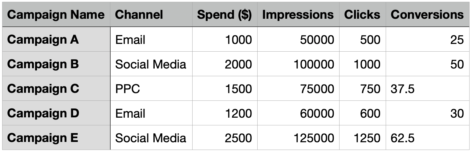
- Upload your campaign data: Simply provide your marketing performance file to DocsGPT. 📤
- Ask in plain English:
- "Show me a pie chart of our total marketing spend distribution by channel from this data."
- "Generate a bar chart comparing the number of conversions we got from each channel."
- "Which campaign generated the most clicks, and can you visualize clicks per campaign?" - Instant Visualization & Insights: DocsGPT processes the data, generates the Mermaid.js code, and displays the charts directly. It can also help you pinpoint key takeaways from the data.

Untangling Code Narratives: Visualizing Git History 🌳
Understanding the evolution of a codebase, especially in a collaborative environment with multiple branches and merges, can be like deciphering an ancient script from raw git log outputs. It's hard to see the big picture.

- Provide your Git logs: You can paste relevant output from
git log(e.g., for the last few days, specific branches). - Ask for a visual:
- "Generate a git graph from these logs for the 'main' and 'feature-X' branches over the past 3 days."
- "Highlight merge commits in this git history." - Clear Git Graph: DocsGPT interprets the log structure, generates the code for a git graph, and renders it, showing branches, commits, and merges visually.

Quickly grasp recent project evolution, improve code reviews, and make branch strategies more understandable. Visualizing commit history makes complex development workflows transparent.
The Power of "Show, Don't Just Tell" 🌟
The beauty of this integration is its versatility. Charts from marketing data and git graphs from logs are only examples, the possibilities are vast:
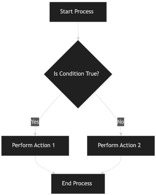
- Flowcharts: Map out processes or decision trees from textual descriptions.
- Sequence Diagrams: Illustrate API call flows or system interactions.
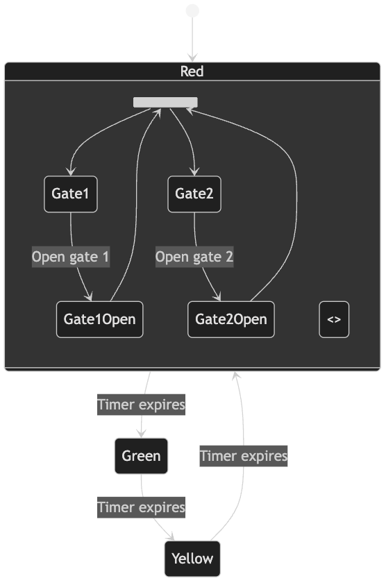
- State Diagrams: Describe the lifecycle of objects or system states.
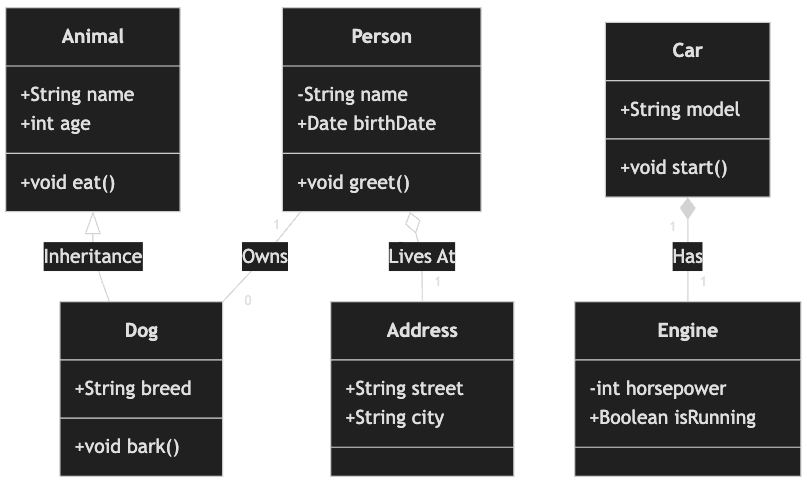
- Class Diagrams: Outline software architecture.
- Gantt Charts: Visualize project timelines and dependencies. 🗓️
DocsGPT and its ability to understand context doesn't just create a diagram you ask for, it can help you figure out what to visualize to best understand your information. It's about moving from static information to dynamic.


All diagrams generated by DocsGPT
See Your Data and Systems in a New Light 💡
The integration of AI-powered diagram generation into DocsGPT is more than just a new feature; it's a new way to interact with and understand your information. It's about transforming complexity into clarity, instantly. 🚀
Whether you're an analyst needing to make sense of data, a developer trying to understand code evolution, or anyone looking to visualize processes and systems, DocsGPT now provides a powerful, intuitive tool to help you see the bigger picture.
Ready to bring your data and ideas to life?
- Try it now 👈
- Explore the Repository 📚
- Join our Community on Discord, X and LinkedIn 🤝
Stop just reading - start seeing, with DocsGPT